Dave McCaughan asks a few basic questions …. like, can 2018 be better than last year?
I spent a lot of time the last couple of days looking across my digital social network and the broader press looking at reviews of 2017 and predictions/hopes for 2018. Most of my friends seemed to think we should have been relived to finish a bad year and that the one we are all starting just has to be better. Which just get’s me wondering “Was it really that bad?”, and “Will the next one be better?”
No denying there was a lot of trouble and strife: The Trump debate, the North Korea question, the disasters, terrorist attacks, the Weinstein furor. I am sure every one can list out what seems a mind numbing series of things that made 2017 “a terrible year”. But then … go search and you can quite easily find a lot of positives as well. Economies generally were ok, maybe not great but ok. You can find lots of articles that will explain that for most people, in most countries unemployment was drifting down, life expectancy and general health measures going up. My friends at The World Toilet Organisation tell me progress was made, well slow progress to get us closer to the day when everyone has access to a toilet. In my home country the majority of people celebrated the long overdue passing of marriage equality legislature. The “big news” seemed awful most of the time, but the news about daily life for most was not too bad it seems.
The way we “see” a year is usually a reflection of bubble we live in, the collective “media” we are each exposed to and our interpretation based on that input. So how to reassess what happened and what the new year holds ?
We use the earth.ai platform to get a neutral view of what is really happening.
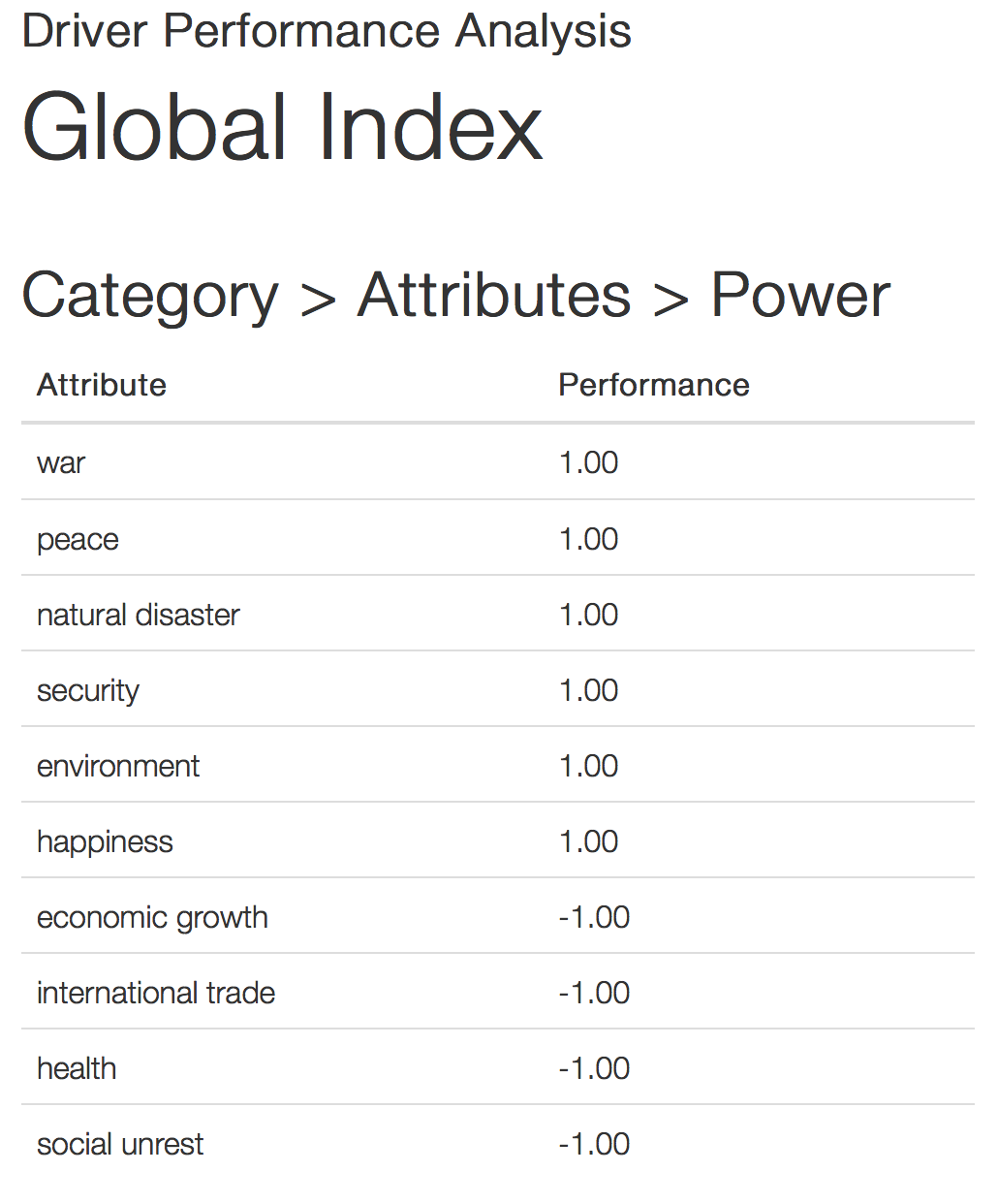
First the platform identified the ten attributes that really define the subject area around reviewing and predicting what happens in a particular year and scores their contribution to overall performance measurement of the year in question. A positive value indicates that engagement with the attribute makes a positive contribution to performance:
A few surprises?
A few years ago I met the guy who developed the Bhutanese Happiness Index. He is Bhutanese and was an academic in the UK. Apart from the “we are Shangri-la come to life and peace and happiness and smoke a little more weed and there is no pain” mumbo that many associate that measurement with it turned out the whole Happiness Index idea is really quite a good platform for measurement. He explained that what might have sounded like reasonable “facts” such as surveys have for a century shown that economic “wealth” and happiness (either personal, familial or communal) don’t correlate very well. You know you have read that … Bulgaria or somewhere like that is nearly always happier than the USA (pre or post Trump). A better economy makes less happy people a little less unhappy etc.
The SigSys platform correlations between attributes is indeed really interesting:
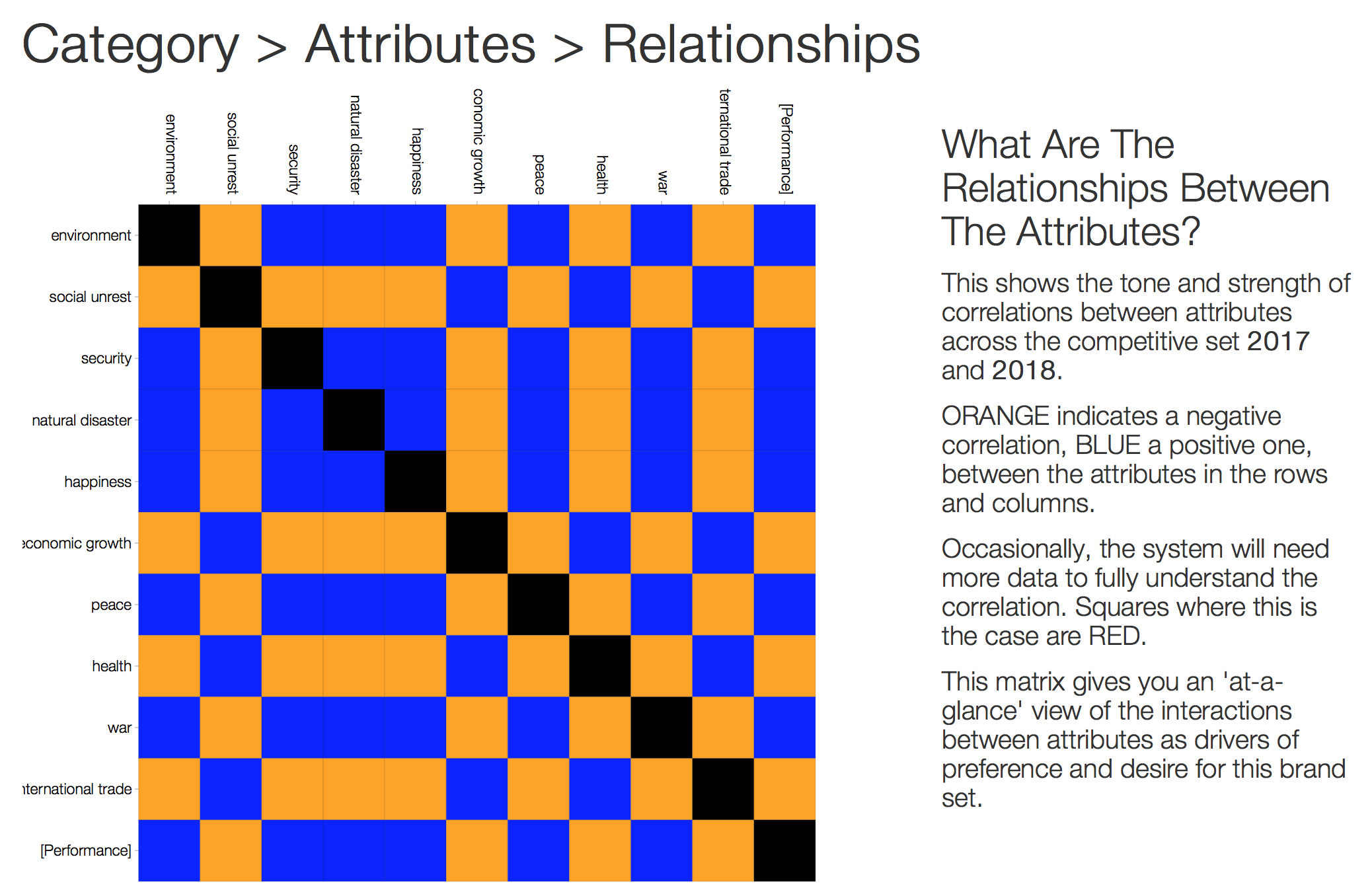
“big stuff” (war, peace, natural disaster, security) … the things that obviously kill or let people think they will live are at the top. Happiness of course is more likely when you think you are not going to die. Happiness itself is also more likely comes from not dying
“man made stuff” (economy, trade, social unrest … and yes health) less relevant because we are too slow to just figure it out and do something about it. The aspects of life that we could control we do a poor job of and so our happiness is less dependent on them.
Now you are saying “what?” … has Dave lost it? Not me. Trust the analysis.
The SigSys platform works by searching across the whole publicly available internet and reading all articles relevant to the topics asked. It then measures their content, not by measures of numbers of reads etc but by looking at what the articles are really saying and how relevant they are to the topic. It then uses context analysis to understand what emotions are being generated by the articles and plotting the emotions affect (see the chart*).
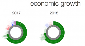
Affect is a rich measure of the emotional tone of the significant content. Understanding of the emotional drivers of the market allows you to better understand what is happening. In these charts, positive emotions are highlighted in green, whereas negative emotions are red. If there is a clear tonality to the emotions expressed, such as expectation or apprehension, that is shown in purple. The intensity of the colour indicates the intensity of each emotion.
So here’s the interesting thing … both 2017 and 2018 offer a lot more dark green, positive emotion than we might all have individually thought. Yes we there are dark red emotions like fear and anxiety. But for the most part the response to last year and expectations of this year is a lot of joy and happiness. And there is gratitude. Maybe in part driven from happiness that “we/I survived” or look forward to surviving. But look through the tab marked “power index” tab in the report and you will see that the most powerful content is really focused on finding a positive way to happiness.
So sure we can all talk about impending doom. And whether you read/watch CNN, FOX, The Economist, Linkedin posts or any of your favourite sites you know they will focus on the crisis of the day. So step back, breathe and look at the whole picture and maybe it’s not that bad.
Register with us today, and we’ll gift you 100 points. that’s a US$100 value, sufficient for you to run a Narrative Analysis™ of your own — for free.
You can read the full report that the platform generated around 2017 reviews and 2018 predictions here : Driver Performance Analysis—Global Index
* The width of each arc reflects the degree to which the named emotion contributes to the overall emotional response. Broad emotions, such as fear and love, are closer to the centre of the chart. The more subtle emotions, which contribute to those broad emotions, are shown in the concentric rings further out. Moving out from the centre, each ring shows a further level of detail.